How do you write App Store screenshot captions that convert?
Good App Store screenshot captions state one benefit in a few plain words, sit above a screenshot that shows the app delivering that benefit, and are ordered so the first one to three carry your strongest reasons to install. Apple says those first images can appear in search results when no app preview is available, so treat them as your ad, and test changes with product page optimization rather than guessing.
Screenshots are the part of a product page most people actually look at. Apple lets you feature up to 10 on the App Store, and says that "depending on the orientation of your screenshots, the first one to three images will appear in search results when no app preview is available, so make sure these highlight the essence of your app." For many searchers, those images are the whole listing.
Captions are the short lines of text placed on or around each screenshot. They turn a screen that only makes sense to existing users into a reason to install. This guide gives rules for writing them, a recommended order, examples, platform rules for Apple and Google Play, and a simple testing plan.
Key takeaways
- The first three matter most. Apple says the first one to three screenshots can appear in search results when there is no app preview.
- One benefit per caption. Say what the user gets, not what the button is called. A few words, large type.
- Show the app in use. Apple's guideline 2.3.3 requires screenshots to show the app in use, not just title art, a login page or a splash screen.
- Google Play is stricter on text: keep taglines under 20% of the image and avoid claims like "Best", "#1" or "Download now".
- Test, do not guess. Apple's product page optimization runs up to three treatments for up to 90 days.
Why do screenshot captions matter so much?
Store visitors decide fast. They see your icon, name, rating and the first screenshots, often in a search result list, before they ever open the product page. Apple's guidance is to make the first images "highlight the essence of your app" and to "focus each subsequent screenshot on a main benefit or feature so that you fully convey your app's value."
Raw app screens rarely do that alone. A dashboard, a settings list or an empty state means little to someone who has never used the app. A caption tells them what they are looking at and why it matters. Your title and subtitle bring people to the listing, which we cover in our guide to App Store title and subtitle keywords; screenshots and captions do most of the work of converting them.
What are the rules for benefit led captions?
- Lead with the outcome. "Plan a week of meals in 5 minutes" beats "Meal planner." Ask what the user gets, saves or avoids.
- One idea per screenshot. If a caption needs "and," it is probably two screenshots.
- Keep it short. Aim for about three to seven words in the main line. People read captions at thumbnail size, often in a search list.
- Use the customer's words. Pull phrases from reviews, support tickets and search terms. If users say "budget," do not write "expense allocation."
- Make the screen prove the caption. The UI under the caption should show the benefit happening: the finished plan, the saved amount, the translated sentence.
- Be specific and honest. Numbers help when they are true for most users ("Set up in 2 minutes"). Never claim results the app cannot deliver.
- Make text readable. Large type, strong contrast, no paragraphs. Check every caption on the smallest supported device.
- Keep a consistent layout. Same font, position and style across the set so the eye moves from benefit to benefit.
What do weak and strong captions look like?
| App type | Weak caption (feature label) | Stronger caption (benefit) |
|---|---|---|
| Budgeting | Transactions dashboard | See where every dollar goes |
| Language learning | AI chat mode | Practice real conversations out loud |
| Fitness | Workout library | 20 minute workouts, no equipment |
| Photo editing | Background tool | Remove any background in one tap |
| Project management | Kanban board | Know what your team is doing today |
| Note taking | Sync settings | Your notes on every device |
Notice that the stronger versions still describe the real feature underneath. Captions that promise something the screenshot does not show tend to create disappointed installs and poor reviews, which hurt you later.
In what order should screenshots appear?
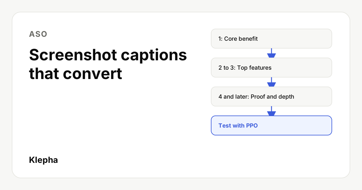
Order is a priority list. A structure that works for most apps:
| Position | Job | Example caption |
|---|---|---|
| 1 | The core benefit, the reason the app exists | Learn a language by speaking it |
| 2 | The most wanted feature that delivers it | Get instant feedback on pronunciation |
| 3 | The strongest differentiator against alternatives | Lessons built around your goals |
| 4 to 6 | Secondary features, common objections answered | Works offline on your commute |
| 7 and later | Depth for convinced users: integrations, privacy, settings, Dark Mode | Your data stays on your device |
Three ordering tips:
- Assume only the first three are seen. Each should make sense alone, because a searcher may only see them in the results list.
- Mind orientation. Apple notes the number shown in search depends on orientation. Portrait apps usually show more screenshots side by side than landscape ones.
- Use the rest of the set. Apple suggests that if your app supports Dark Mode, you "consider including at least one screenshot" that shows it. Later positions are a good home for that.
If you have an app preview video, Apple says the screenshot behavior in search changes, because the preview can appear instead. Make sure the preview's first seconds carry the same core benefit as screenshot one.
Store search is not the only search
People also ask ChatGPT, Gemini and Perplexity which app to use. A free Klepha report shows whether those answers mention your app and which competitors they recommend.
Get my free reportWhat do Apple and Google Play allow?
| Topic | Apple App Store | Google Play |
|---|---|---|
| Number of screenshots | Up to 10 | Up to 8 per device type; at least 2 to publish; at least 4 at 1080px or more to be eligible for some recommendation formats |
| What they must show | The app in use, "not merely the title art, login page, or splash screen" (guideline 2.3.3) | The in-app experience; exclude text that is not part of the core experience where it can be cut off |
| Text overlays | Allowed, for example to demonstrate input methods (2.3.3) | Taglines only if necessary, no more than 20% of the image |
| Claims to avoid | Anything inaccurate about the app | Rankings, awards, testimonials, prices or promotions; words like "Best", "#1", "Top", "New", "Discount"; calls to action like "Download now" |
| Accessibility | Readable text at device size | Alt text of 140 characters or less for each screenshot |
The Google Play rules mean a caption that works on iOS may need a shorter, plainer version for Android. "The #1 budgeting app" is out on Play; "See where every dollar goes" is fine on both. Always check the current specifications in App Store Connect and Play Console before you export, since sizes change with new devices.
How do you test screenshot captions?
On the App Store, use product page optimization. Apple lets "a test include up to three treatments with alternate app icons, screenshots, and app previews," shown to a share of randomly selected visitors, and a test "runs for 90 days or until you manually stop it." Apple also advises: "Consider how many elements you change in a treatment so you can more easily determine which one led to a particular result."
A practical plan:
- Test the first screenshot first. It has the biggest reach. Change only the caption and keep the image the same.
- Then test order. Swap positions two and three, or move your differentiator to the front.
- Give it enough traffic. Low traffic apps need longer tests. Do not stop when one version leads after a few days.
- Read conversion rate, not only installs, and check that retention does not fall for the winning version.
- Roll out and repeat. Keep a log of every caption tested and its result.
Google Play Console offers store listing experiments for the same purpose. The principle is identical: one change at a time, enough traffic, a clear success metric. For a full listing review, follow our ASO audit, and see SEO vs GEO vs ASO for how store optimization fits with web and AI search.
Should you localize screenshot captions?
Yes, for every market you take seriously. Apple supports separate product page localizations, and its guidance includes localizing screenshots and previews along with the description and keywords. A caption that is clear in English can be confusing, too long or culturally off in another language, and translated text often runs longer, which breaks layouts designed for short English lines.
Good localization goes beyond translation:
- Rewrite, do not translate word for word. Start from the benefit and write the most natural local phrase for it.
- Check length per language and adjust font size or line breaks so captions stay readable.
- Localize the screens too. Show the app interface, currency, dates and example content in the local language.
- Reorder if needs differ. The feature that matters most in one market may be secondary in another; test the order per locale when traffic allows.
A quick caption checklist
- Does screenshot one state the core benefit in under about seven words?
- Can each of the first three be understood alone?
- Does every screen show the benefit its caption promises?
- Are captions readable on the smallest device you support?
- Is there a Google Play version without banned words or calls to action?
- Is a product page optimization or store listing test planned?
If your app also needs visibility on the web and in AI assistants, our expertise page explains how we cover ASO alongside SEO and GEO, the solutions page lists where Klepha can help, and our case studies show how we measure it.
Sources
- Apple Developer, "Creating your product page", screenshots section, accessed November 13, 2026. developer.apple.com
- Apple Developer, "App Review Guidelines", guidelines 2.3.3 and 2.3.4, accessed November 13, 2026. developer.apple.com
- Apple Developer, "Product page optimization", accessed November 13, 2026. developer.apple.com
- Play Console Help, "Add preview assets to showcase your app", screenshot requirements and guidelines, accessed November 13, 2026. support.google.com
Frequently asked questions
How many App Store screenshots should I use?
Apple lets you feature up to 10 screenshots. Use enough to cover your core benefit, main features and common objections, but put most effort into the first three, since Apple says the first one to three can appear in search results when no app preview is available.
What makes a good App Store screenshot caption?
A good caption states one user benefit in a few plain words, uses the language customers use, and sits above a screen that shows the app delivering that benefit. Avoid feature labels that only make sense to existing users.
Can I put text on App Store screenshots?
Yes. Apple's guideline 2.3.3 allows text and image overlays, but screenshots must show the app in use rather than only title art, a login page or a splash screen.
Are Google Play screenshot rules different?
Yes. Google Play allows up to 8 screenshots per device type, asks that taglines take no more than 20% of the image, and says to avoid claims about rankings, awards, prices or promotions and calls to action such as Download now.
How do I test which screenshots convert better?
Use Apple's product page optimization, which supports up to three treatments with alternate screenshots, icons and previews for up to 90 days. Change one element at a time, starting with the first screenshot, and compare conversion rates.